

Showing posts with label colour to bw processing. Show all posts
Showing posts with label colour to bw processing. Show all posts
Thursday, 21 July 2011

Friday, 15 July 2011
summer's power

Ah, summer, what power you have to make us suffer and like it.
I was looking for a quote to go with this image and this one by Russell Baker just made me smile. Because me, I'm definitely a summer sufferer - although I'm not really liking it. At all. Basically, everything above 20 degrees Celsius is already too hot for me, and the 30+ degrees and 80+ % humidity we occasionaly get in summer in Zürich make me suffer a lot.
But there are also things I like about summer, for example when the sky suddenly darkens on a summer Sunday afternoon, big rain drops starting to fall first timidly from the dark clouds in the sky, one by one, quickly gaining confidence and soon pouring down with a force that soaks you through to the bone in seconds should you happen to be outside. But you're not. You're snuggled up on the sofa, with a hot cup of tea, watching the rain splash against the window, the bolts of lightning across the sky, one closely followed by the next, feeling the walls and floor of the house shake around and below you when two clouds clash right over you in a deafening noise. I like these moments. I love them. They're fleeting moments, the storm quickly moves on, the thunder fading in the distance. But the smile lingers on the lips for a bit, body and mind welcoming the cooling of the hot summer air the storm brought with it, even though the sun's already coming back through the clouds.
I took this picture for this week's (week 28) theme of 52 in Twenty Eleven, which is Black & White. There's s little field of sun flowers on my way to work, and of course I couldn't resist stopping for a few minutes, earlier this week, to take a few pictures. But you see, the thing is, yellow isn't really one of my favourite colours, at all, and yellow flowers, well, I'm afraid I'm just not very fond of them, at all. Not even sunflowers, I'm afraid. So they were just perfect for the black & white theme :).
I haven't quite made up my mind about Flickr yet, wether to go on or quit, or something in between. The thing is that Flickr, blogs - both writing and reading - painting, each of these take up time, and together, they take up a lot of time, and it has now got to the point where I'm struggling to keep up with it all - with the result that I'm doing a little bit of everything but nothing quite right. So I need to downsize a bit in order to being able to really concentrate on what I'm doing and to get satisfying results, and right now, I feel like I want to concentrate more on painting and my blogs. I feel like I've missed out on too many things. The 52 of Twenty Eleven project, for exampe. I've just not been able to keep up with anything. But then the 52 of Twenty Eleven is a Flickr thing. So it will probably be 'something in between', at least for the moment.
Wednesday, 13 July 2011
how to: selective colour
The charasteric English red phone booths. I know, they're so cliché. Especially with a selective colour treatment. But you just simply can't spend two weeks in London and not take at least one picture of one or more red phone booths.

I've only learnt how to do selective colour effects a few weeks ago, but I just love it. I found this video tutorial extremely useful, especially as a PSE8 user, which means there's no layer mask option yet. But although I've been busy practicing this technique before my holiday, after two weeks, I had quite forgotten how to this. I just needed a quick reminder, and just didn't have the patience to watch the whole video again. So I've made a little tutorial here, summing up the steps to achieve the effect.

Open up a picture, then:
1. Duplicate background layer.
2. Turn the image into a black & white image, for example by selecting one of the Photoshop preset
and adjust some of the levels until you're happy with the black & white effect.
3. (Pre PSE9 and Photoshop Full Version) Create a level adjustments layer underneath the
background copy layer.
4. Clip the background layer onto the levels adjustments layer by pressing ALT and clicking on the
line between the two layers. This allows you to use the mask of the levels adjustments layers for
your background copy.
5. Click on the Select a soft brush, choose black as foreground colour, and brush over the area
where you want to bring back the colour (here the two telephone booths). Switch to white as
foreground colour and brush carefully ove those areas where you revealed too much of the
colour underneath to turn them into black & white again.
6. - 8. Add adjustment layers, such as levels, contrast and saturation adjustments, if required.
9. Add a photo filter if required (I used a Photoshop warmfilter (85) at 22 % here).
10. Add your watermark if required.
I hope you might find this useful, just as a little reminder.

I've only learnt how to do selective colour effects a few weeks ago, but I just love it. I found this video tutorial extremely useful, especially as a PSE8 user, which means there's no layer mask option yet. But although I've been busy practicing this technique before my holiday, after two weeks, I had quite forgotten how to this. I just needed a quick reminder, and just didn't have the patience to watch the whole video again. So I've made a little tutorial here, summing up the steps to achieve the effect.


Open up a picture, then:
1. Duplicate background layer.
2. Turn the image into a black & white image, for example by selecting one of the Photoshop preset
and adjust some of the levels until you're happy with the black & white effect.
3. (Pre PSE9 and Photoshop Full Version) Create a level adjustments layer underneath the
background copy layer.
4. Clip the background layer onto the levels adjustments layer by pressing ALT and clicking on the
line between the two layers. This allows you to use the mask of the levels adjustments layers for
your background copy.
5. Click on the Select a soft brush, choose black as foreground colour, and brush over the area
where you want to bring back the colour (here the two telephone booths). Switch to white as
foreground colour and brush carefully ove those areas where you revealed too much of the
colour underneath to turn them into black & white again.
6. - 8. Add adjustment layers, such as levels, contrast and saturation adjustments, if required.
9. Add a photo filter if required (I used a Photoshop warmfilter (85) at 22 % here).
10. Add your watermark if required.
I hope you might find this useful, just as a little reminder.
Monday, 20 June 2011
last morning in vienna
On my last morning in Vienna, I just strolled around the streets in and around the city centre, taking some last shots before it was time to return to the hotel, get my bags and go to the airport.
I like cities that have trams. It's my favourite means of transport in a city, which is probably because I grew up near a city with over a dozen tram lines. I especially like the older ones, that still look like the goold old, old fasioned trams. In my city, the old ones are almost all gone, replaced by modern, much more silent (almost too silent for my taste) ones. In Vienna, there are still some older ones left. And they're a nice red, which is especially nice for a selective colour treatment.
Looks like this is going to develop into a little series of "Selective Colour Vienna" :).
I like cities that have trams. It's my favourite means of transport in a city, which is probably because I grew up near a city with over a dozen tram lines. I especially like the older ones, that still look like the goold old, old fasioned trams. In my city, the old ones are almost all gone, replaced by modern, much more silent (almost too silent for my taste) ones. In Vienna, there are still some older ones left. And they're a nice red, which is especially nice for a selective colour treatment.
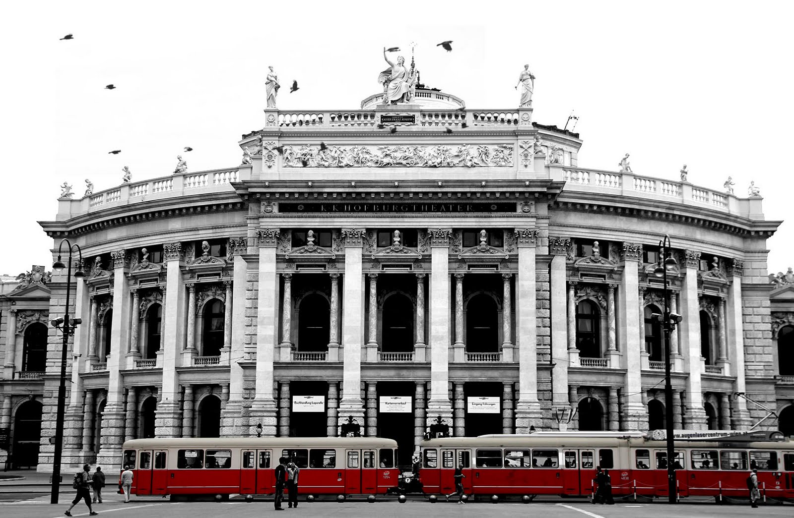 |
| Vienna, Burgtheater, May 2011 |
Saturday, 18 June 2011
selective colour
Don't you just love the selective colour effect? I think it's a really great effect and can looks just gorgeous on certain photos (unless you don't overuse it). I also think it always looks so impressive and extremely professional, and I've never quite dared to try to find out how to do it. The only selective colour conversion I've used so far is the very simple desaturating all colours except the one you want to keep with a hue/saturation levels adjustment. Which obviously is very limited, as it only works if the colour in question doesn't appear anywhere else in the picture, which is rarely the case.
A Flickr friend of mine is using this effect very impressively and inspiringly, and has kindly shared with me the how to. I also found this easy to follow, step-by-step video tutorial (I just love video tutorials!!) and finally found the "courage" to give it a try myself. The trick is a simple layer mask. Which Photoshop Elements 8 unfortunately doesn't have, but it's actually very easy to "borrow" one. It's explained in the video as well. And then, it's just brush work :).
This is just a quick try, but I'm quite pleased with the result. I was waiting for quite some time, hoping for this bright tourist sightseeing bus to drive away and allowing me a full view of the Staatsoper. But it just wouldn't move, and so it now became a feature :). You can of course experiment much more with the background, to turn it into a great black & white background, and maybe even add textures. In the video tutorial, the black & white conversion is done with using one of the presets, which is something, I somehow, don't know why, just don't really like using. But for a first try, I think it's quite okay :). I'll certainly be doing more of this now!
A Flickr friend of mine is using this effect very impressively and inspiringly, and has kindly shared with me the how to. I also found this easy to follow, step-by-step video tutorial (I just love video tutorials!!) and finally found the "courage" to give it a try myself. The trick is a simple layer mask. Which Photoshop Elements 8 unfortunately doesn't have, but it's actually very easy to "borrow" one. It's explained in the video as well. And then, it's just brush work :).
 |
| Vienna, Staatsoper, May 2011 |
Friday, 17 June 2011
adjusting/removing colour
I found this adjustable black & white tutorial while looking for ways of converting colour images into black & white. It's a completely new way for me but it works very nicely and allows much more room to play with hue, saturation and light, than for example the conversion using a gradient map (which is what I usually do).
Just a quick try, I'll have to try it out again later, and explore the possibilities.
Just a quick try, I'll have to try it out again later, and explore the possibilities.
 |
| Vienna, Staatsoper, May 2011 |
Thursday, 16 June 2011
wiener würstl
This Würstelstand (wurst stand) in the centre of the city, near my hotel quickly became one of my favourite places during my long weekend in Vienna. You can get a whole range of sausages, but my alltime favourite is definitely the Käsekrainer - a sausage filled with melted cheese. Yummy! What I also liked is that you get your sausage not only cut in pieces, but it is served on a realy china plate, and not the usual paper/plastic one. So there's no rushing away, eating your meal while running around (although you can get a hot dog version with all sausages for this), but you have to take a few minutes to eat your sausage.
 A digital colour shot, turned into b&w and with some slight contrasts and levels adjustments.
 And with an added warm-up filter.


Subscribe to:
Posts (Atom)